
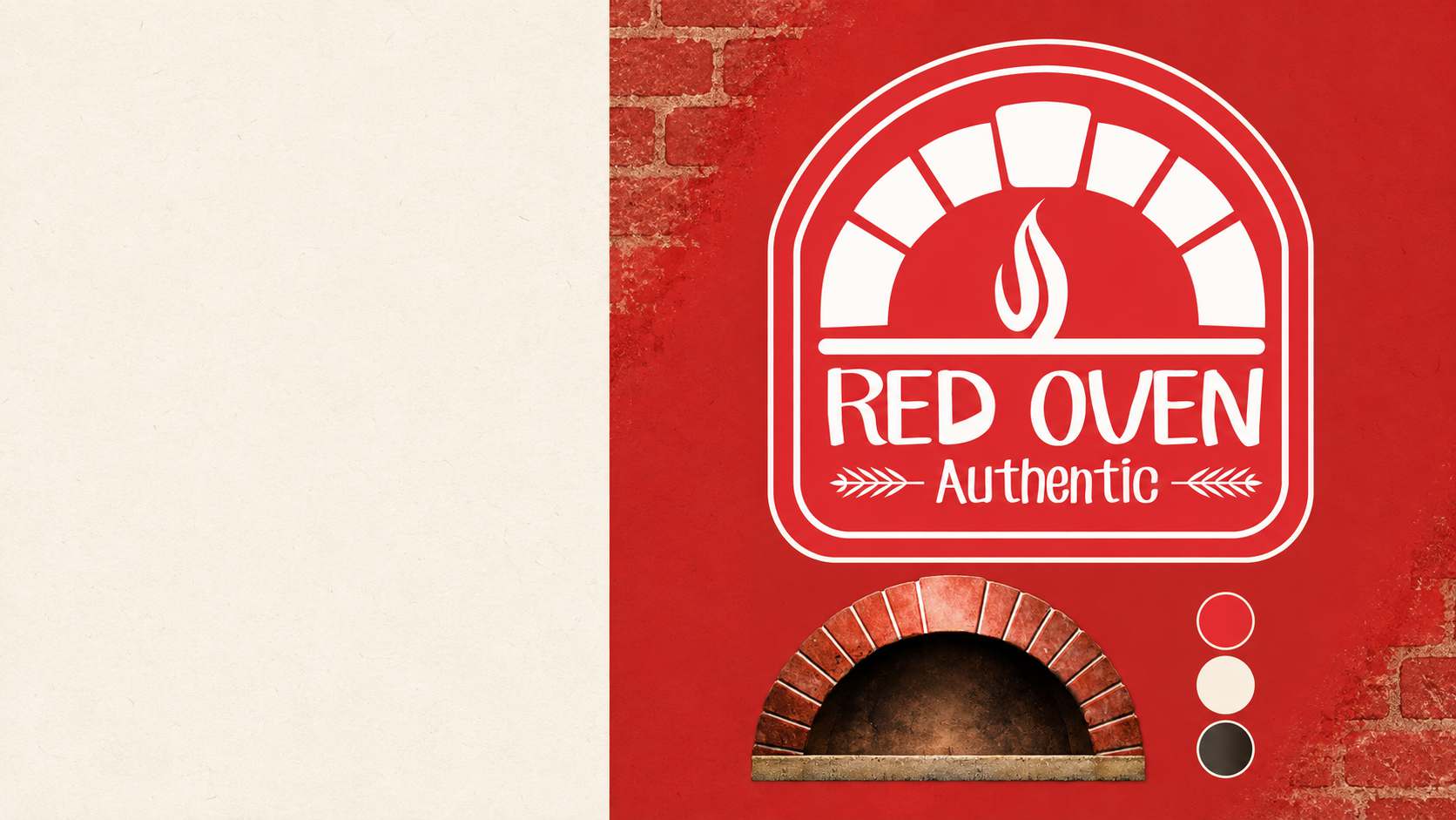
A customer first sees Red Oven from across the street. At the counter, they want to read the menu. Walking home, they carry the name on a pizza box. I designed the identity to work at all three distances.
The oven became the sign
I started with the brick arch around the mouth of a traditional pizza oven. Its outline gave the badge a distinctive shape, and a flame at the centre connected the name to the food. White artwork against oven red kept the mark legible on the building. I chose CF Jack for the lettering because its informal shapes suited a place making pizza by hand.
At the counter
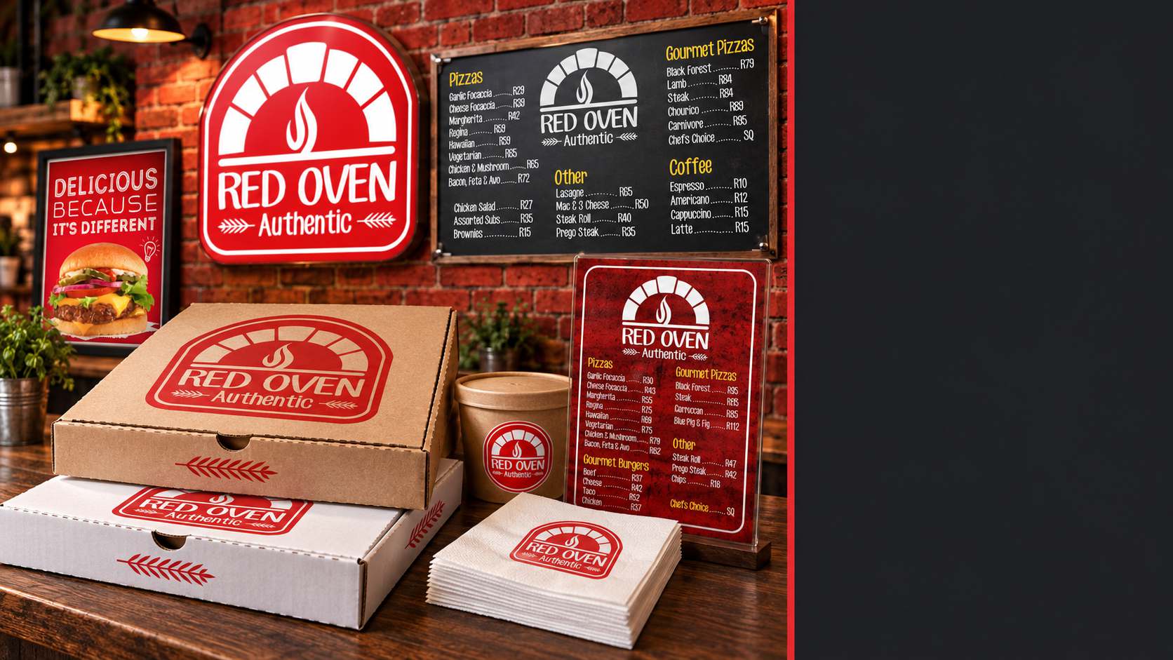
The exterior sign had one name to carry. The menu boards had pizza names, descriptions and prices, all competing for the same space. I used the arch, brick textures and red headings to organise the menu, then adapted the layout for a printed copy a customer could read in their hands.
What left the restaurant
The badge had to hold together on a kraft pizza box, a white box and a small food label. Keeping the arch and flame in one compact mark gave me something I could scale down for a serviette and still recognise when it sat on the counter beside the larger packaging.
I took the work through production artwork. The full rollout was produced, including building and regulatory signage, promotional banners, menu boards, printed menus, pizza boxes, takeaway containers, product labels and branded paper serviettes.
Discuss a Brand Identity Project