

I have seen this more times than I care to count. A logo is placed on a T-shirt, a cap, a bottle, a tote bag and half a dozen smaller products. Everything is lined up on a presentation page and called a merchandise collection.
It is not a collection. It is repetition.
A proper collection needs a backbone. The products must feel related without looking identical. They need a clear customer, a reason to exist and enough flexibility to work across different shapes, materials and price points.
That does not begin with choosing products. It begins with deciding what story the products are there to tell.
Start with the story, not the shopping list
The early questions are rarely glamorous, but they matter:
- Who is buying this?
- Where will they encounter it?
- What should they remember about the brand, destination or experience?
- Is the purchase practical, emotional, collectible or gift-led?
- Why would they choose this product over the one beside it?
Until those questions have useful answers, selecting products is just filling shelves.
In destination merchandise, the source material might be wildlife, architecture, landscape, food, local language or cultural character. In brand-led retail, it may come from an existing identity, service standard or customer promise. The job is to find the strongest thread and build around it.
For an Alaska cruise-retail concept, for example, the visual story combined wildlife artwork, buffalo plaid, topographic line work and a lodge-inspired palette. Those elements created a recognisable world that could extend across apparel, drinkware, bags, sleepwear and gifting without forcing one piece of artwork onto everything.
That is the difference between decorating products and developing a collection.
Build a visual system with enough room to move
Once the central story is clear, it needs a working visual language.
- Hero illustrations
- Supporting icons
- Repeat patterns
- A controlled colour palette
- Type treatments
- Materials and finishes
- Trims, labels and swing tags
- Packaging and display ideas
Not every element belongs on every product. A large illustration that works beautifully on a tote may become unreadable on a keyring. A repeat pattern may suit a shirt or notebook, while a small icon may be stronger on a cap, magnet or leather accessory.
The system must give each product enough character while keeping the family resemblance intact.
I think of it much like a workshop. Every tool has a different job, but it belongs to the same bench. If every tool were a hammer, the bench might look organised, but it would not be terribly useful.
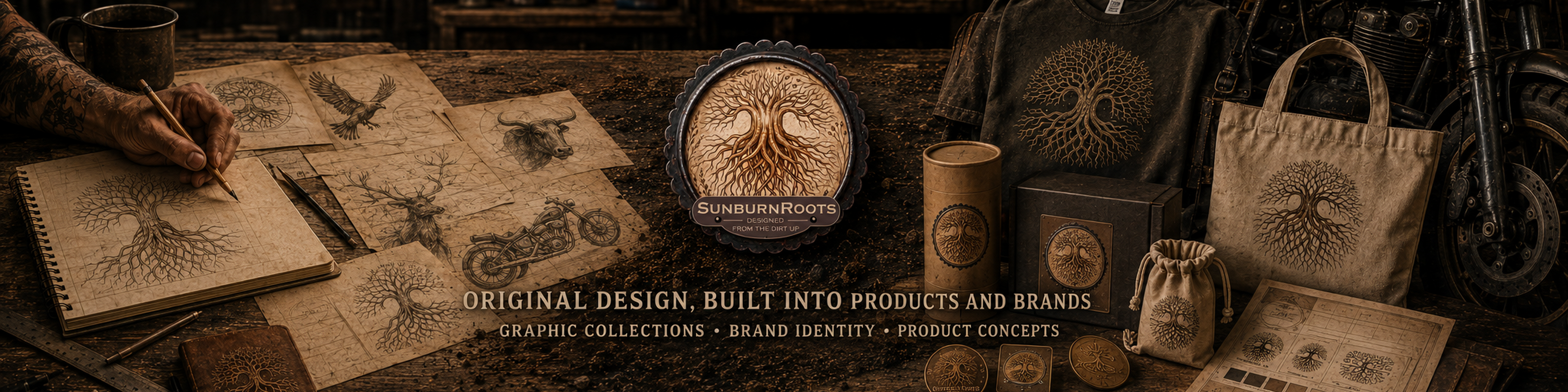
Give the range an architecture
A merchandise collection also needs commercial structure.
There are usually hero products that carry the strongest visual statement. There are dependable everyday items that broaden the audience. There may be accessible impulse purchases, premium pieces, gift sets and products designed specifically for collectors.
The exact mix changes according to the customer and retail setting, but the questions remain similar:
- What attracts attention from a distance?
- What can a customer pick up without much consideration?
- What feels special enough to become a gift?
- Which products can support a higher price point?
- What gives the customer a reason to buy more than one item?
This is where design and retail thinking must work together.
A beautiful product that does not fit the range, price structure or customer journey may still be a poor commercial decision. Design has to earn its place on the shelf.
Prove the idea on real objects
A visual direction can look convincing on a mood board and fall apart the moment it meets an actual product.
Curved drinkware distorts artwork. Embroidery removes fine detail. Garment seams interrupt patterns. Bag panels impose awkward proportions. Packaging needs room for product information, barcodes and legal requirements. Materials absorb colour differently, and a screen that glows beautifully is not the same thing as ink, thread, metal or fabric.
That is why product application is part of the design process, not something added at the end.
I normally test a direction across several different categories early. Apparel, drinkware, bags and small accessories quickly reveal whether the idea has genuine range or whether it only works in one carefully controlled example.
The weak ideas become obvious. So do the strong ones.
Respect production before production teaches you manners
There is always a point where creative enthusiasm meets manufacturing reality.
Print areas have limits. Embroidery has minimum line weights. Suppliers work with specific materials, colours and processes. Packaging must fold, close, stack and survive handling. Costs matter. Minimum quantities matter. Timelines matter.
None of this kills creativity. It gives creativity something solid to push against.
My years in design, product businesses, farming and handcrafted soap have taught me the same lesson repeatedly: an idea is only useful once it can be made properly and repeated reliably.
The designer therefore needs to think beyond the image. Artwork specifications, colour references, dimensions, dielines, production methods and supplier-ready files are part of the finished job.
If it cannot be manufactured correctly, it is still an idea, not a product.
Present one system, not a pile of mock-ups
As a range develops, the presentation becomes a working tool.
A good merchandise deck or collection guide allows decision-makers to understand the complete direction without having to assemble it mentally from scattered images. It should explain the concept, colour palette, artwork families, materials, applications and product hierarchy clearly enough for creative, retail, sourcing and production teams to make informed decisions.
For larger collections, that document becomes the bridge between concept and rollout.
In one core cruise-retail concept, the collection guide grew to cover apparel, outerwear, headwear, bags, drinkware, leather accessories, travel items, games and confectionery packaging. The value was not simply showing more products. It was showing how the same brand could remain coherent across all of them.
Clarity saves time. It also prevents the collection from being slowly dismantled by dozens of disconnected decisions.
Edit until the range feels inevitable
More products do not automatically create a stronger collection.
Sometimes the best decision is to remove the item that does not belong, simplify a pattern, reduce the number of colours or allow one product to be quiet while another does the shouting.
This is where experience can look deceptively simple. The final collection may feel obvious, but only because the wrong turns, weak applications and unnecessary clutter have already been cut away.
A full shelf can still be an empty idea.
The goal is not to make everything match. The goal is to make everything belong.
From first idea to retail-ready range
A successful branded merchandise collection moves through a disciplined sequence:
- Understand the customer, setting and commercial purpose.
- Find the strongest story.
- Build a flexible visual system.
- Structure the range across useful product and price categories.
- Test the direction on real product forms.
- Resolve materials, production and artwork requirements.
- Present the collection as one coherent commercial system.
- Edit until every product earns its place.
That is the work behind the work.
Customers may never see the research, rejected sketches, colour tests, supplier constraints or presentation decks. They simply see a collection that feels considered and complete.
That apparent ease is not an accident. It is the result of building the range properly from the beginning.