
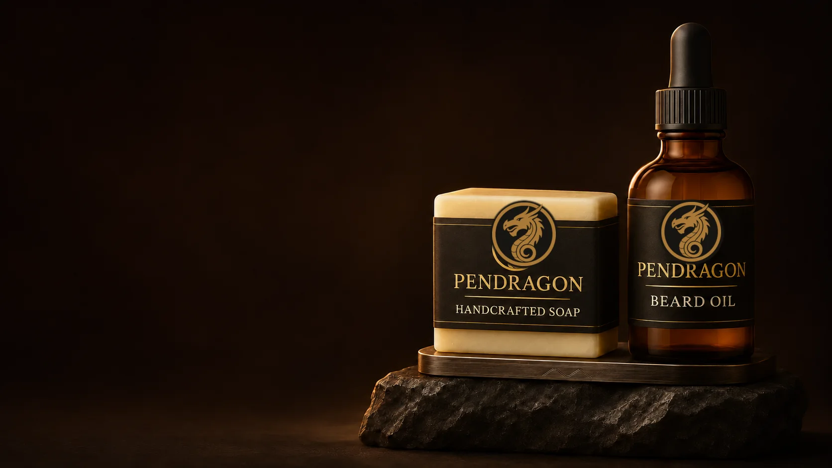
In the soap workshop, there is a shelf I refuse to tidy.
It holds the experiments that did not quite earn a place in the range: half-cured batches, fragrances that sounded better on paper, awkward textures and bars that never made it past testing. It is not a display of failure. It is a record of the tuition fees paid while learning how physical products really work.
When I began making soap, the temptation was to change everything at once. A different oil, another scent, a new mould or a fresh packaging idea made each batch feel exciting. The trouble was that excitement did not produce clarity. With too many variables moving at once, it became difficult to know what had improved, what had gone wrong and what could be repeated.
That shelf taught me one of the most useful lessons in brand building: you cannot brand chaos.
A logo can identify a product. It cannot make the product coherent, reliable or worth buying again. Those things have to be built into the product long before the wrapper goes on.
The brand begins in the batch
As a graphic designer, I naturally notice the visible parts of a brand: the name, typography, colour, packaging and presentation. As a product maker, I have learnt that the brand begins much earlier.
It begins with what the bar is meant to do, how it feels in use, how the fragrance behaves and whether the result can be made again with confidence. If those fundamentals change from one batch to the next, the identity on the outside is little more than decoration.
Branding is not a promise written on a label. It is a promise kept through repetition.
This is particularly unforgiving with a physical product. A customer may admire the packaging once, but they experience the product every time they use it. If the second purchase bears little resemblance to the first, the design has not solved the problem. It has merely disguised it.
A pretty wrapper around an inconsistent product is not branding. It is camouflage.
Novelty can become noise
Product development rewards curiosity, but curiosity needs boundaries.
There is always another fragrance to try, another ingredient to investigate and another variation that could become part of the range. Each one may be interesting on its own. Put too many of them together too soon, however, and the customer is left to make sense of the maker's enthusiasm.
Pendragon has been a useful test of this discipline. The wider concept allows for a collection of distinct House identities across shaving soaps and creams. It is very easy to design twenty labels. It is considerably harder to make twenty products feel as though they belong to one house.
The sensible route is to finish one product properly. Prove the formulation, format, packaging, costing and production rhythm, then use that knowledge as the foundation for the next one. Breadth should be earned through depth.
That approach is less dramatic than launching a large collection, but it produces something far more useful: a system that can grow without losing its shape.
Handcrafted does not mean casual
The word handcrafted can suggest instinct, improvisation and small-batch charm. Those qualities have their place, but a good handmade product still requires discipline.
If a batch works, the maker needs to know why. If it fails, the same applies. Notes, measurements, suppliers, timing and changes all matter because memory is a poor production system. The aim is not to remove the human hand. It is to make sure the human hand can produce a dependable result.
Repeatability is often mistaken for dullness. In business, it is trust.
A returning customer should recognise the product they chose before. There will always be natural variation in handcrafted work, but variation should not become an excuse for confusion. The craft lies in controlling what matters while preserving the character that makes the product worth choosing.
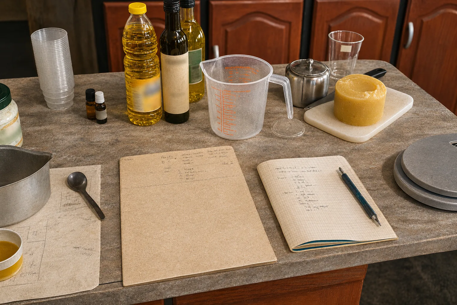
Soap has no interest in your launch date
Handcrafted soap teaches patience in a rather blunt way. A batch needs the time it needs. A marketing calendar cannot hurry it along, and an enthusiastic launch announcement does not make an uncured product ready.
That reality changes the way the business must be planned. Production has to happen before the stock is needed. Materials and packaging have to be ordered in time. Finished products need somewhere suitable to cure and be stored. Cash is committed before sales arrive.
A business plan that ignores curing time is a wish list wearing a spreadsheet.
This is one of the quiet differences between selling ideas and selling physical goods. The product occupies space, consumes materials and moves according to a real production sequence. Patience is not a romantic virtue added to the brand story. It is part of the operating model.
Packaging starts with the product
Packaging is where design and production either cooperate or begin an expensive argument.
The design has to present the product clearly, but it also has practical work to do. It must fit, close, stack, carry the necessary information and survive ordinary handling. It should suit the price of the product and the way it will be sold. Every extra layer adds cost, labour, weight and waste.
The most impressive box on a screen is not always the best answer on a workbench.
For a handcrafted soap range, a well-designed paper band may do more useful work than elaborate packaging that costs too much and slows production. Restraint can make the product feel more confident, particularly when the material, typography and information hierarchy have been considered properly.
Good packaging does not shout over the product. It introduces it, protects it and then gets out of the way.
Costing is part of the creative work
It is easy to cost the obvious ingredients and assume the calculation is finished. It is not.
Packaging, labels, wastage, testing, labour, storage and the less successful batches all have to be carried somewhere. A product that looks profitable only because the maker's time has been ignored is giving a false report.
This does not mean every small producer needs to behave like a large factory. It does mean the numbers must be honest. The selling price has to support the next batch, not merely recover the oils used in the last one.
If the numbers do not hold, the beautiful wrapper is decorating an expensive hobby.
Costing can also improve the design. It forces decisions about pack size, range width, materials and production steps. Constraints are not always the enemy of creativity. Quite often, they are what stop creativity from wandering off with the budget.
Failure is information
The untidy shelf in the workshop is useful because every rejected batch records a decision.
Some experiments reveal that an idea is not worth pursuing. Others show what needs to change. The important thing is not to romanticise failure, but to extract its value. A mistake becomes expensive when it is repeated without learning.
That principle applies equally to branding. A confusing label, an awkward pack or a product nobody understands is not simply bad luck. It is evidence. The response should be to inspect the problem, remove assumptions and make the next version clearer.
Progress often looks less like a sudden breakthrough and more like a batch that worked because the previous one did not.
Edit the range until it makes sense
Every maker has more ideas than a small business can sensibly carry. The difficult work is deciding which ideas deserve materials, packaging, shelf space and attention.
A product should have a clear customer, a clear purpose and a reason to sit beside the others in the range. If it cannot explain its role, it is probably adding noise rather than value.
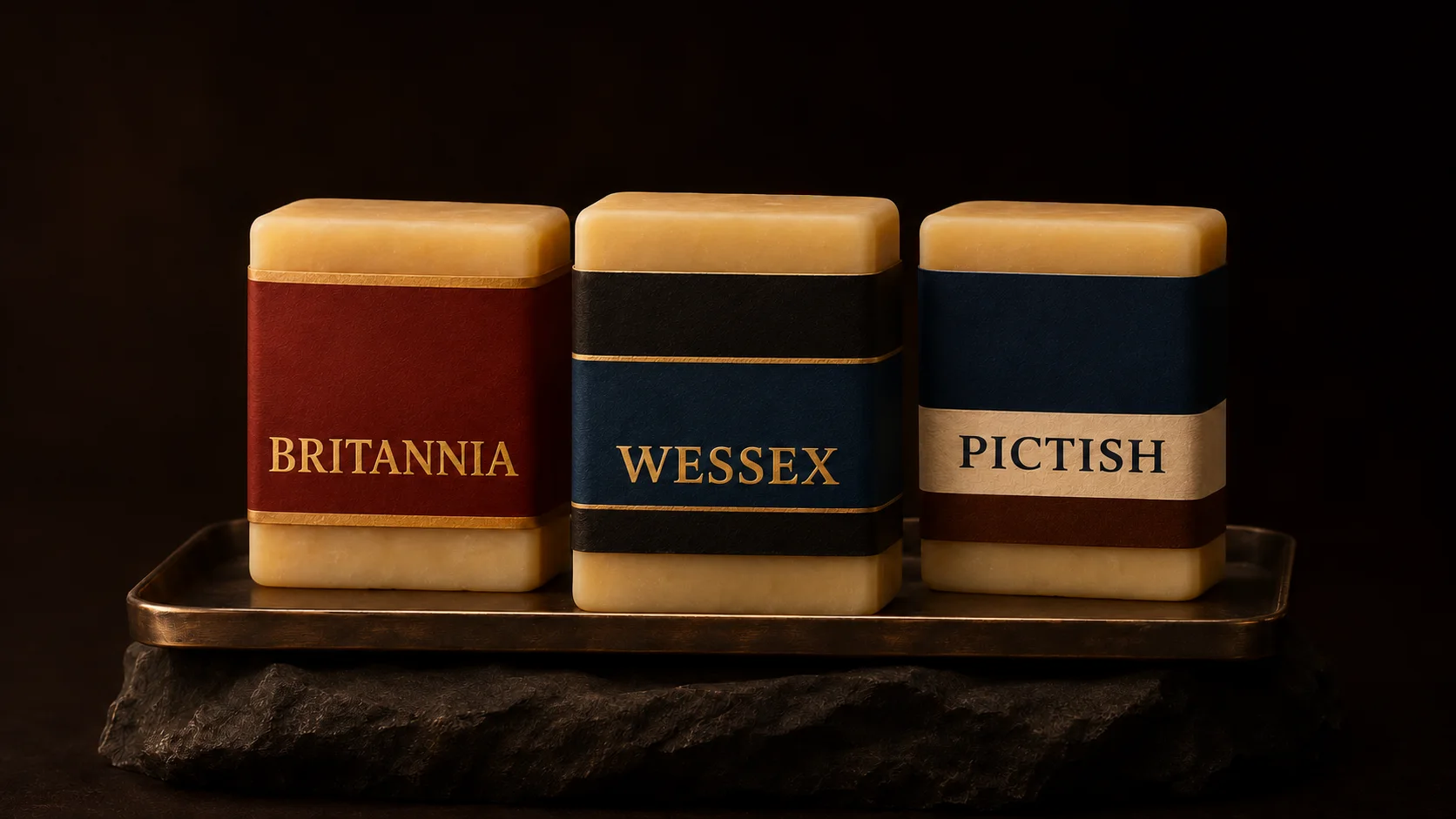
For Pendragon, the central direction of spiced citrus, oud and leather provides a strong centre of gravity. The character should feel masculine without swagger, rooted in heritage without turning into costume, and crafted without becoming sentimental about the craft.
The House system can introduce variation later, but that variation has to sit inside a disciplined product and visual structure. Otherwise, what looks like a range is simply a collection of unrelated ideas wearing similar labels.
Editing is not a lack of ambition. It is how ambition becomes legible.
The wrapper comes last
Before putting a name and identity on a physical product, I now ask a more useful set of questions:
- Can it be made again reliably?
- Does it have a clear purpose and customer?
- Does the packaging protect and explain it?
- Do the numbers work honestly?
- Does it belong in the range?
If the answers are uncertain, more graphic design will not rescue the idea. The product needs more work.
Handcrafted soap has taught me that a brand is not the decoration added at the end. It is the pattern of decisions that makes the product trustworthy. The identity gives those decisions a recognisable face, but it cannot make them on the maker's behalf.
Make it clear. Make it repeatable. Then make it recognisable.
The wrapper comes last. The promise comes first.